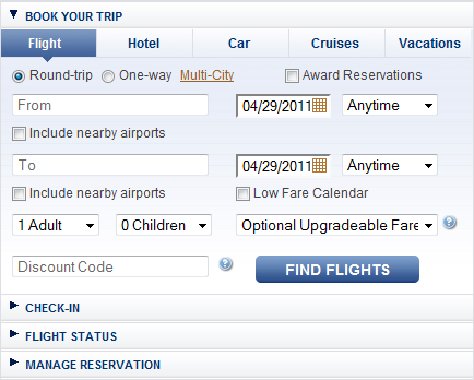
Homepage forms
A main portion of the alaskaair.com redesign project was an update to the collection of search forms that customers could use to find flights, hotels, car rentals, cruises, and vacation packages. I was tasked with redesigning the flight, cruise, and vacation search flows on the front page. The visual theme had already been built for the redesign project, so my role was to design and format these interactions to accommodate usability and accessibility needs.

Examples
A short explanation of the design considerations behind the Homepage and Plan & Book search forms
Plan & Book forms
The Plan & Book search forms are similar to the alaskaair.com homepage search forms in that performing the same search using the two methods will yield the same results. The difference between the two is that Plan & Book searches are meant to be utilized more frequently when customers are looking to purchase multiple services from Alaska Airlines.

Additionally, I conducted a very quick usability study to test the order in which people were most comfortable filling out the "Cities and Dates" portion of the multi-city flight search.

Process
For each part of the Alaska Airlines website redesign project, I incorporated a user-designed method that accomodated the project timeline as best as possible:
Examples
A short explanation of the design considerations behind the Homepage and Plan & Book search forms
Mileage Plan registration
Like most other airlines, Alaska Airlines has a program for frequent flyers called Mileage Plan. I was given the chance to redesign the registration page. This ignited my love/hate relationship with web-based forms, but resulted in a page that I felt was a significant improvement over the original design. Prior to project completion, I conducted a usability study with 3 design variations to test how quickly users could complete the form, how easily they could understand the completion requirements, and perceived complexity of the page upon first view.
Examples
This is the Axure prototype that I build both for demonstration purposes and to conduct a usability test.
Usability testing
I was the first designer on my team to build and utilize Axure prototypes for usability tests so that participants would have a more appropriately realistic experience. Using interactive prototypes instead of using only printed mockups allowed participants to act more naturally. This frequently drove participants to speak more openly about their thoughts while interacting with the prototype, resulting in more accurate and complete feedback.